Wayfair eCommerce Website Feature Redesign
An iterative, customer research-informed redesign of Wayfair’s Quick View function

Overview
Project:
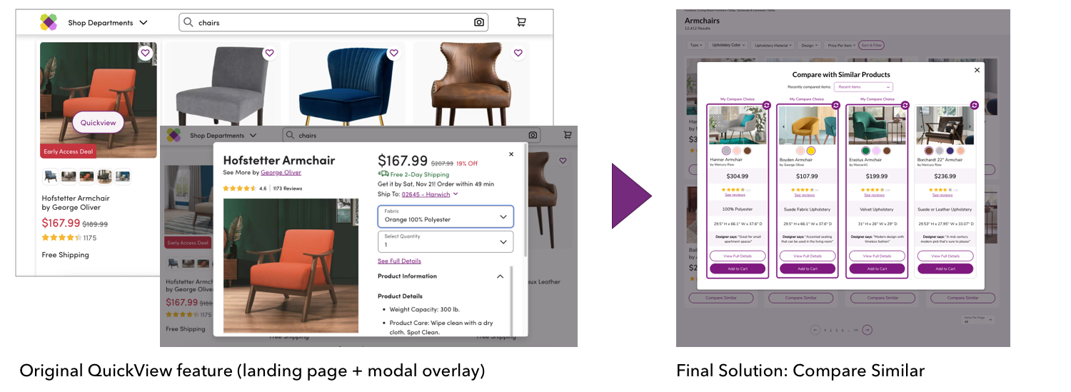
This project to reimagine Wayfair’s Quick View interface provided a unique opportunity to consider how even the smallest site functions can make a huge impact on customer experience, and ultimately, business success. Several rounds of user interviews and usability tests served as the “glue” to guide our iterative research and design process, and drove our solution to satisfy customer needs and accelerate purchase decisions through a new Compare Similar function.
Goals:
Increase discoverability of call-to-action
Decrease time spent making a purchase decision
Increase customer confidence in purchase
Company: Wayfair, e-commerce furniture and homeware
Team: Four researchers; Agile team structure
Role:
Team Management
Research
Sketching & Prototyping
Customer Testing
Client Presentation
Date: March - May 2020

Tools
Moving to remote work at the beginning of the project due to the coronavirus pandemic, our team used online tools to stay on track and in touch with new information. These were helpful for my role as “Scrum Master,” keeping track of our task list and project schedule.

Miro, an online whiteboarding tool, was used to share and report findings

Trello helped our Agile team stay on track for each sprint

From Research through Final Solution, User Testing served as the “glue” of our process
Process
Research + Analysis
We met with the Wayfair project team to understand the history of the feature, project needs, and deliverables from our research. From this conversation, we understood that user feedback and solutions to decrease time to make a purchase decision would be most important to our stakeholders. So, our team began with a four-part Research and Analysis process which allowed us to identify a key insight to drive our design process while finding issues and opportunities to speed shopper’s product selection process.

Key Insight: Customers carry “visual picture” of what they are searching for, but struggle to find it quickly
Issues
Non-persistent call-to-action creates usability issues
Quick View does not provide product details customers find most helpful to move forward with purchase
Decision fatigue leads to task abandonment
Opportunities
Simplify shopping journey to guide customer through purchase decision
Provide quick access to key information users are seeking to differentiate from competitors
Improve visual search capability
Concept Design
Walking through the shopping process with ten participants, we were able to solicit user feedback from the current Wayfair site about which product details customers find most helpful to see in a quick view to either quickly abandon or move forward with a purchase.

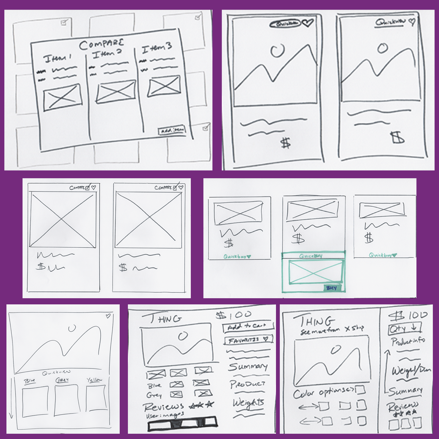
Working synchronously as a team, we ran a quick “Crazy 8’s” design sprint exercise to sketch out proposed concept designs incorporating this feedback. We also considered the emotional, functional, and social Jobs-to-be-Done for several concepts we were considering.

Select Crazy 8’s Design Sprint Sketches

Emotional, functional, and social Jobs-to-be-Done
After comparing the shared features of our concept sketches, we created three concept designs to explore user’s top-rated feature functions: Compare Similar, QuickView Update, and Build-a-Room. Again, we asked 10 users to provide feedback on each of our three concept design wireframes.

Prototype Iteration
The Compare Similar concept was widely-favored by eight of nine customers interviewed because it allowed them to see key information critical to making a purchase decision while still relying primarily on visual comparison. One of our teammates was tasked with creating a polished prototype incorporating these features:
Price, a large product image, and the modal popup structure overlaying a product page carried over from Wayfair’s current Quick View function.
Customer reviews, material information, product dimensions, and designer quotes requested during customer interviews.
A static Compare Similar button, rather than a quick view button appearing on hover, to support best practice in UI based on our research.
A new feature to auto-populate similar products for comparison based on visual similarity indicators to support our key finding that customers are better able to make a decision based on visual comparison over written tags or other non-visual descriptors.

Product Page

Modal PopUp
In our last round of user testing, the user group was enthusiastic about this prototype and provided further critical feedback on design usability.
On the product page, an Add to Compare checkbox was at odds with the Compare Similar button
On the popup page, sorting and refreshing functions caused confusion
“Color swatches” preferred over small product mockups
Users requested more control over selecting or rejecting products for comparison

Solution
Our final Compare Similar prototype solution incorporated design research, three rounds of user testing, and a team assessment of how best to respond to direct customer feedback while prioritizing Wayfair’s business goals. The final design provides the flexibility of one or multiple product selection for comparison with easy refresh functionality to decrease the time and mental energy it takes for a shopper to visually compare products in order to reject or follow through with a purchase.
Our final design provides well-considered solutions for customer and client:
Benefit for Wayfair:
Ability to easily compare and filter in consideration phase lowers task abandonment
Higher chance of add to cart and purchase
Benefit for customer:
Saves time with filters for selection process
Recommendations decrease cognitive load
Increases confidence in purchase

Product Page

Modal PopUp: Compare One

Modal PopUp: Compare Multiple
Challenges
Switching to remote team collaboration challenged our proposed project plan, but regular communication via Slack, Miro, Trello, and Zoom kept our work on track
Infrequent check-ins with the Wayfair project team may have been a hurdle, but our team was able to quickly identify the client’s needs following our kick-off meeting and orient our research towards those goals
Results and Reflection
I was responsible for presenting our findings and final solution to the Wayfair client team. While two other project teams presented solutions for the same challenge, our prototype was the furthest stretch from the original Quick View design on the Wayfair site. In this case, pulling the most effective components from the Quick View interface and adding new components based on user testing to create an entirely new function, Compare Similar, was the most effective solution to best serve customer and client.
Feedback from the client team around our research and design was very positive. The Wayfair team shared that they would use our research and design insights to make changes to the Wayfair Quick View function.
Next Steps
User testing of our Compare Similar redesign with a larger number of participants will provide more information about usability and any necessary design refinements
Wayfair team implements Compare Similar feature