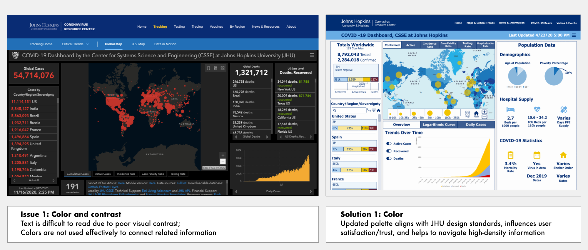
COVID-19 Dashboard Health Data Visualization
A redesign of Johns Hopkins University’s COVID-19 dashboard, employing interactive visualizations to aid in easy visual analysis of global health statistics

Overview
Project:
This redesign of the Johns Hopkins University COVID-19 dashboard optimizes the site for a previously atypical user group - political officials called to make life and death decisions about resource allocation and social intervention to mitigate disease transmission during a rapidly-progressing global health emergency. Interactive visualizations providing more data at-a-glance, including the ability to compare data across geographical regions, support well-informed, data-driven decision-making.
Goals:
Increase legibility using best practices for design of interactive displays
Maximize information display on dashboard homepage
Allow users to compare data across geographical regions
Team: Solo design exercise for graduate-level data visualization course
Role:
Design standards research
Persona selection & definition
Identifying context of use
Sketching & Prototype design
Date: April 2020

Process

Research
I first reviewed existing pandemic influenza modeling and visualization tools currently used by public health officials, such as PanViz, which model potential outcomes for actions related to decision measures, such as education, public alerts, and resource stockpiling.
I then interviewed administrators in a state governor’s office to understand how health data dashboards were being utilized and which of the many available COVID dashboards were most useful to the group. Reports revealed that JHU’s dashboard was viewed most often, but several others were referenced to confirm or fill in missing information.
While study on the use of health data dashboards by non-expert government officials is a largely untapped research area, I was able to find and review literature related to best practices in design for big health data, including data visualization techniques which draw upon the innate abilities of the human perceptual system to efficiently identify patterns across overwhelming amounts of health data.
Defining Persona + Context of Use
Persona: Political Official
Lacks domain expertise and familiarity with disease mapping practices
Must quickly gain a level of understanding in order to make high-stakes decisions about resource allocation and strategies for containing infection
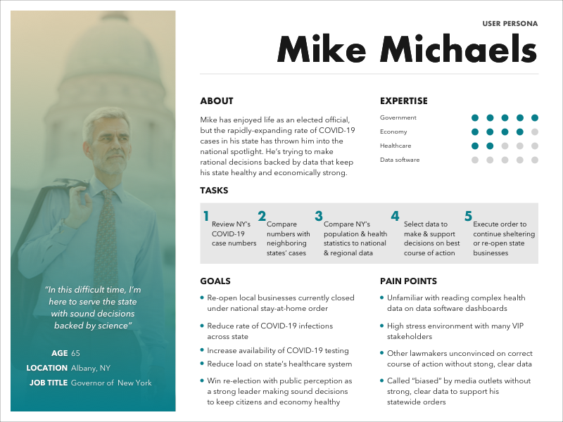
Persona: Political Official
Context of Use
High Stress
Comparing complex datasets
Working with hypothetical situations
Time constraints hastened by transmission rate of disease
Restricted access to healthcare centers – difficult to find source information
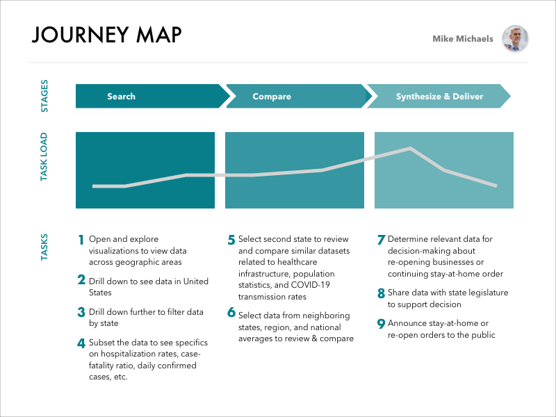
Journey Map
Sketch Iterations

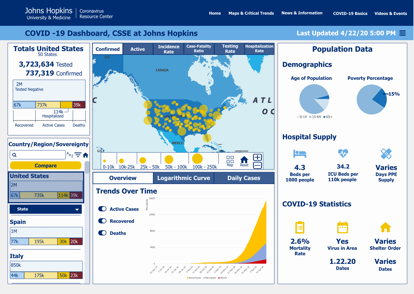
Dashboard Sketches: Source dashboard (L) with misaligned boxes and floating tabs is simplified to focus on a dominant map feature (C), and finally, a three-part dashboard, including Sort, View, and Data
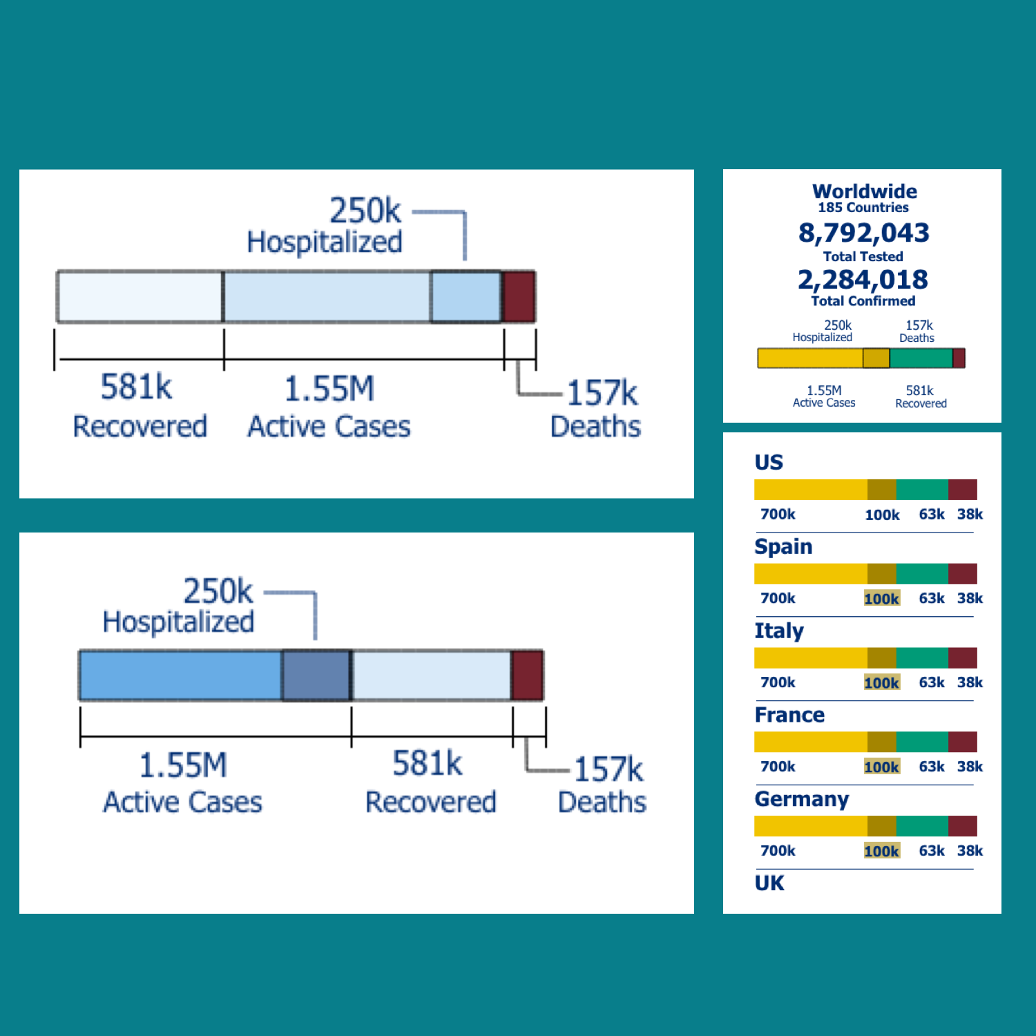
Graphic Bar iterations explore color and format variation to increase legibility

Compare Geographical Data Sketches (L) show difficulty in comparing data of vastly different scales using typical chart or table mapping, while Compare Using Infographics and Small Multiples Sketches (R) explore compare functionality by toggling datasets on/off or pulling in comparable data from bottom or side “drawers”
Solution
Visual Design Issues + Solutions
Interaction Solutions
Task 1: Sort to compare data across selected geographic area



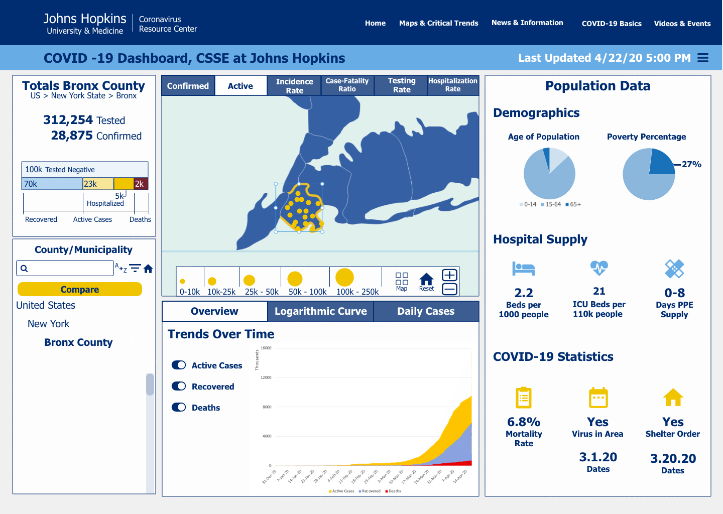
Task 2: Subset to explore relevant data for decision-making

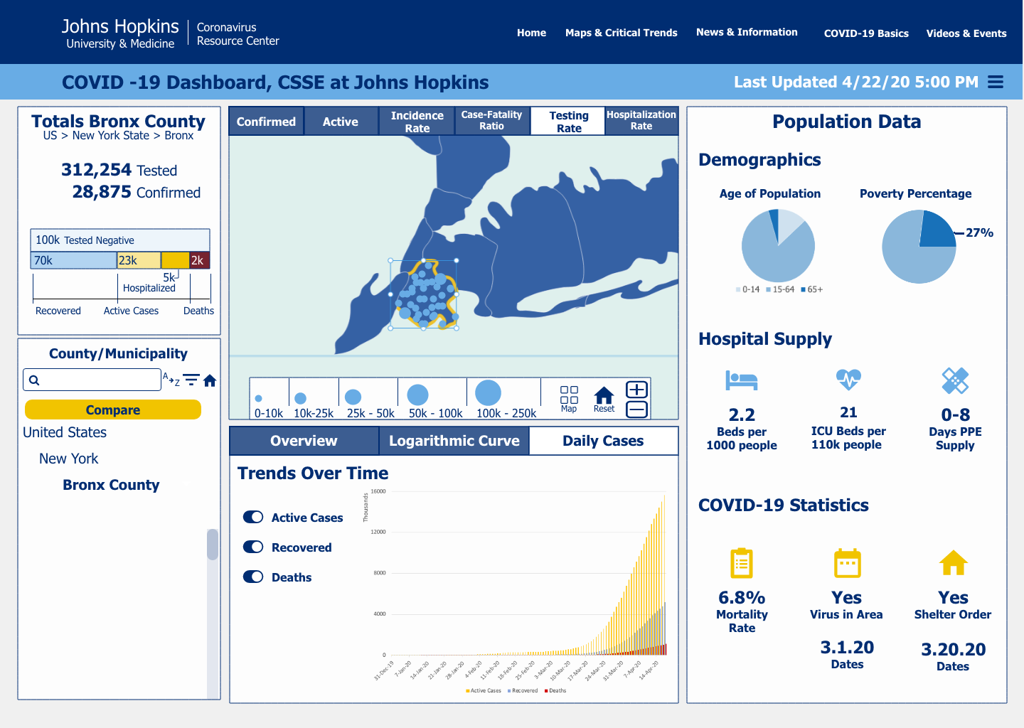
Task 3: Compare data between two data sets


Challenges
There were several limitations to this project, completed in April 2020, including the issue of sourcing real-time data and identifying relevant statistics during the early months of this rapidly progressing COVID-19 viral outbreak event.
Frequent iteration on the source dashboard design also occurred over the course of project, as new data and user feedback encouraged dashboard developers to add features, including an entirely new data dashboard dedicated to United States-based data. Some of this U.S. data, such as health insurance coverage, was specific to U.S. populations and could not be easily applied across a global view. I decided to focus only on datasets that would apply to any audience, worldwide.
Results and Reflection
In the midst of this global health emergency - and the new expectation of political officials to lead the charge on pandemic planning and response - accessible and interactive health data visualizations created for a wide body of expert and non-expert users are a life-saving necessity.
The components necessary for an effective COVID-19 dashboard continue to evolve as scientific research during this long-haul pandemic reveals the most pressing data needs of doctors and decision-makers. As our understanding of the virus and complicating health factors changes, so must the tools we use to capture this data.
This redesign of the JHU platform, made to increase legibility, maximize information display on the home dashboard, and incorporate the flexibility to manipulate and compare data most important to the user, allows a new user group of government officials lacking expertise in epidemiology, public health, or data visualization to efficiently access and analyze data in order to reach well-informed, data-backed insights for decision-making.
Future Direction
Overall, the redesign was applauded for changes to dashboard structure and content. A formal design review by Human Factors graduate students revealed some difficulty reading the bubble map feature carried over from the original design and confusion about color choice for the redesigned map. Future iterations could include a more familiar map palette and should test different methods for displaying data across geographic areas
Next steps for the redesigned dashboard is to undergo usability testing with political officials to uncover specific unmet needs of this user group.
